What is this tool?
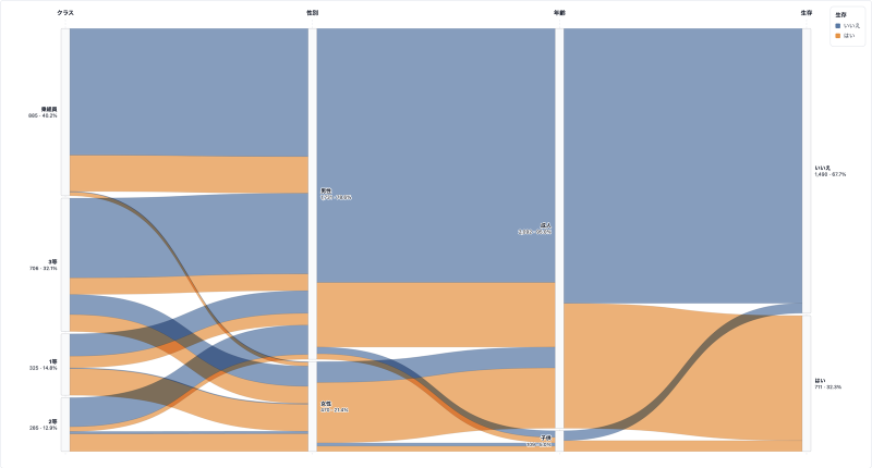
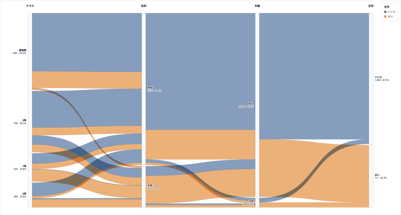
A chart of categorical combinations and counts, drawn as ribbons that flow between parallel axes. Parallel coordinates use lines for numeric values; Parallel Sets use areas for the frequency of categories. Color a dimension to follow which combinations are large and where they split. Annotations, export, cloud save, and public sharing are included.
Features
- Mapping: pick a value column (counts and similar) and at least two category dimensions. If there is no value column, rows can be counted
- Color: color ribbons by the values of a chosen dimension
- Category order: by value, A-Z, or input order
- Appearance: palette, horizontal or vertical layout, curve strength, ribbon opacity, bar width. Toggle ribbons, values, and percents
- Max categories: limit how many categories appear on each axis; the rest are grouped as Other
- Export: SVG / PNG for images, CSV / JSON for data
- Share: publish a public page (
share.html?id=) from a saved project - Project save: store data and settings in the cloud and restore later
How to use
- Upload a CSV, or load a sample
- Check the value column and dimensions in Mapping
- Set color, category order, and style
- Add a title and source in the annotation tab
- Export an image, save as a project, and publish a share page if needed
Data format
- File format: CSV
- First row is the header; following rows are data
- Provide at least two category columns. A numeric count column can be used as the value
- Example: Class, Sex, Age, Survived, Count