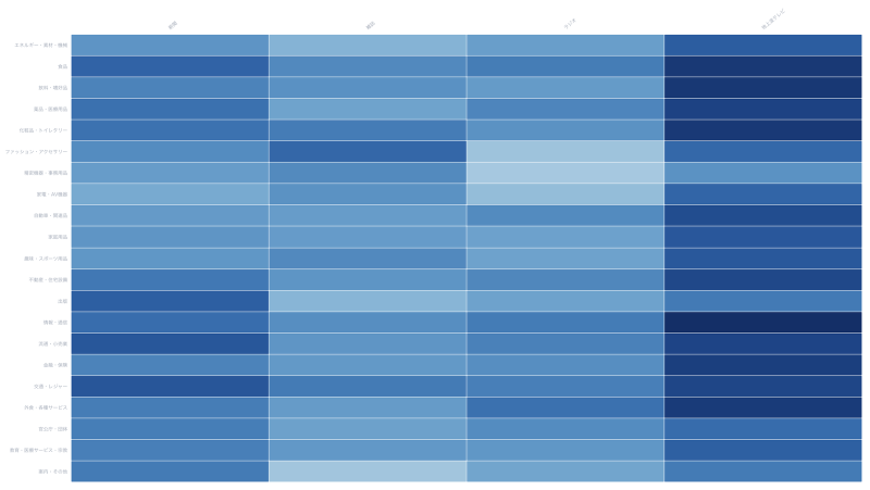
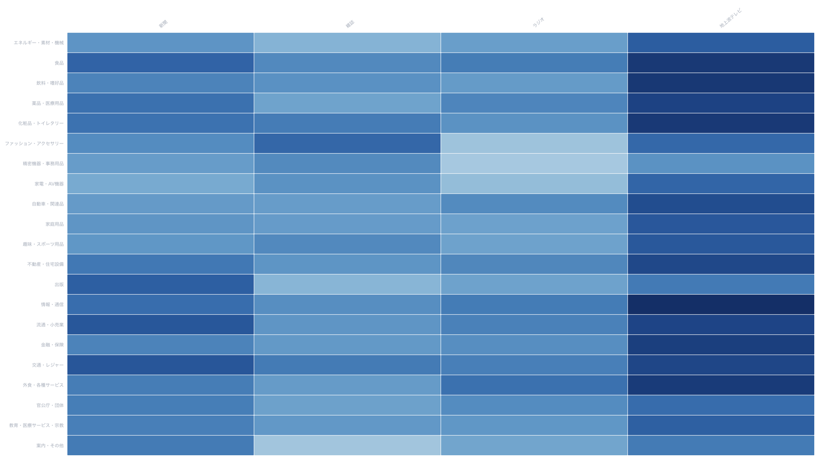
What is this tool?
A visualization tool for crosstabs kept in matrix form: row labels × column labels, with cells as the intersecting values. You do not convert the table into a three-column list. Choose from seven charts: heatmap, mosaic, stacked bar, parallel coordinates, scatterplot matrix, chord diagram, and adjacency matrix. Annotations, export, cloud save, and public sharing are included.
Features
- Chart picker: heatmap, mosaic, stacked bar, parallel coordinates, scatterplot matrix, chord diagram, adjacency matrix
- Sample data: rectangular crosstabs and square matrices (same row and column labels), filtered to the selected chart
- Mapping: set the row-label column and value columns. Total rows and columns can be excluded. Rectangular charts can switch orientation (rows as groups / columns as groups)
- Appearance: color scheme, value labels, stacking mode, and centering colors at 0
- Public controls: reset brushes on parallel coordinates and the scatterplot matrix; reorder an adjacency matrix by name, frequency, or cluster
- Export: SVG / PNG
- Share: publish a public page (
share.html?id=) from a saved project - Project save: store data and settings in the cloud and restore later
How to use
- Pick a chart type (or let a sample open)
- Upload a CSV / TSV / JSON file, or load a sample
- Check the row-label and value columns in Mapping
- Add a title and source in the annotation tab
- Export an image, save as a project, and publish a share page if needed
Data format
- File format: CSV / TSV / JSON
- First column is row labels; remaining columns are column labels. Cells are intersecting values
- Do not use a three-column list (row, column, value)
- If rows and columns are the same set, the matrix is square (movement tables, adjacency). An optional
groupcolumn is used for clusters